![]()
![]()
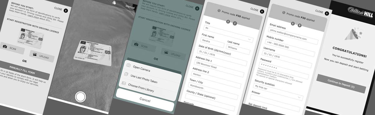
This project is to improve the experience of registration to first deposit. The objective is to get user on board and play as fast a possible. We have analysed there are high percentage of drop off at registration step 1 & 2. Legally we need to capture some details where users are quite not comfortable to share.
I worked in an agile delivery team alongside:
1 Product Owner, 1 Delivery Manager, 1 Business Analyst, 1 UX Designer, 1 UX Researcher, 2 x Developers, 1 Data Analyst , 1 QA.
We kicked off the project with a discovery workshop to interview the cross functional department’s experts and identify the key challenges, opportunities, and goals for the platform.
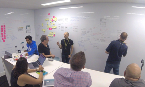
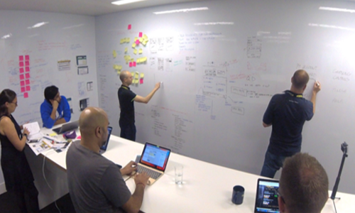
In the design thinking process I have to consider user and business golas I have identified the core goals and pain points for both business and end users and listed them. This step helped me to decrease the gap between business and end users and to design a better solution which helped both the groups.
- More users to sign up with first deposit and play
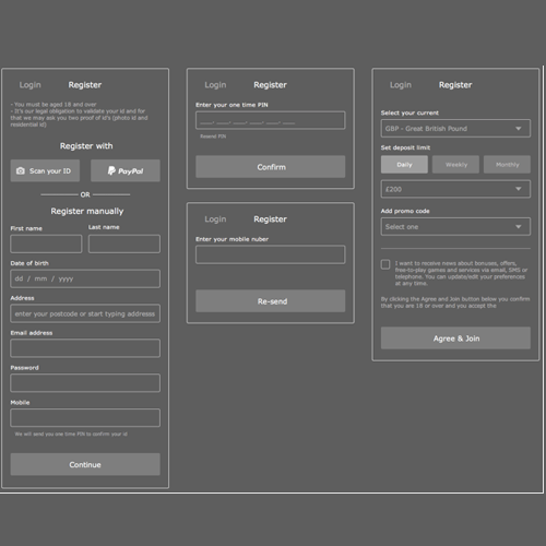
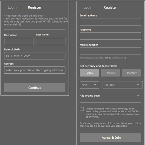
- Easy and simple registration process
- Need to collect information which is not necessary for registration but for marketing
- Too many drop offs at registration
step 1 & 2
- First deposit is not improving
- Too much information required to for registration
- Quick and easy registration
- Well informed form fields but not many
- Clear information about promotions and how to add apply or amend
- Too many fields and time consuming process
- Can’t validate process with OTP so why asking too many things
- Security of personal information is missing
- Only one method of registration
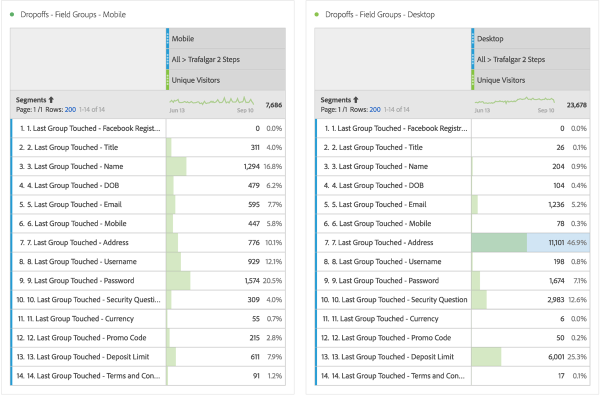
Once we mapped out the goals and pains for both business and users, started gathering the previous evidence and user behaviours by collecting analytic data and wondered what is our competitors are doing.
We found out at what stage users are leaving and why through anlysing the last months data. The data was inconsistant for Mobile and Desktop which gave me another reason to do competitor research and usability testing.
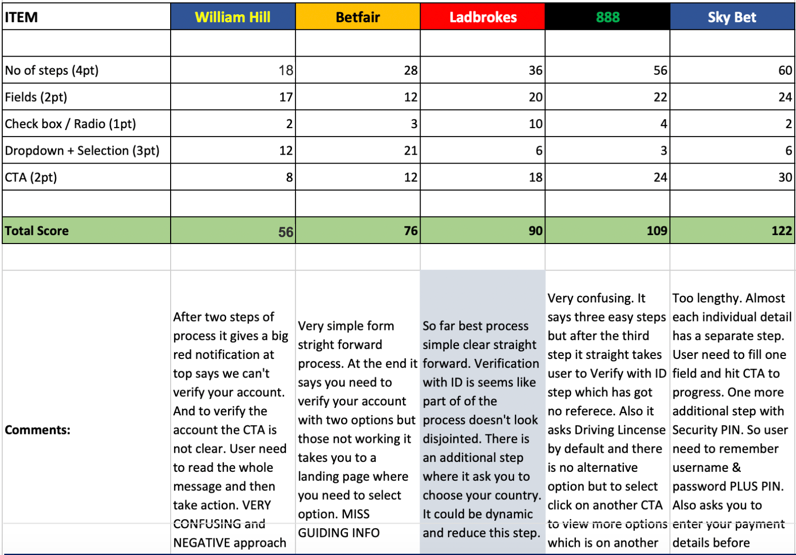
I have used different method to compare the same experience with our competitor and score them to find out who’s doing best and worst. Doing this I can set a benchmark where we trying to reach and create solution towards to achieve that.
Then we analyzed the existing design that WilliamHill had, and mapped out UX recommendations for the best user experience.
This intensive discovery phase and close collaboration with the cross functional team made for a smooth, straightforward process to develop the product’s new UI and design system.
After multiple tests and iterations, I collaborated with UI designers, developers, who built the designs and QA Testers, who ensured that what was being built, looked and behaved as it should.
I began tackling the problem areas that we had defined by generating a range of ideas and designing concepts. I presented the concepts back to the team and we prioritised them and created a product road map. This was based on the efforts it would require to implement them, the impact it would have on the return on investment to WilliamHill as a business.
I created multiple prototypes that were representations of how the concepts would look and feel and returned to the WillaimHill shops several times to observe users and test the prototypes with them. Allowing them to use the prototype in their comfortable place helped me achieve a more accurate representation of how the app would be used in its real environment.
After multiple tests and iterations, I collaborated with UI designers, developers, who built the designs and QA Testers, who ensured that what was being built, looked and behaved as it should.
Some of the initial problems Business and Users faced were somewhat solved by using features from the existing design. We collaborated with the Cross Functional Teams and adapted those features to suit our user's specific needs. This saved us time and development effort, while allowing us to implement a solution quickly.